Just 15 minutes + questions, we focus on topics about using and developing nf-core pipelines. These are recorded and made available at https://nf-co.re, helping to build an archive of training material. Got an idea for a talk? Let us know on the #bytesize Slack channel!
This week, James Fellows Yates (@jfy133) will give a basic introduction to the vector-based graphic design tool Inkscape, and then how to use the tool to create the popular ‘tube map’-style pipeline diagrams.
Video transcription
The content has been edited to make it reader-friendly
0 (host) Hello everyone, I’m here today with James Fellows Yates and he’s going to talk about Inkscape and pipeline diagrams.
Thank you very much. This is a repeat of a talk I gave back at the last nf-core hackathon and what I’ll be talking about is how you can make pretty diagrams aimed at improving your documentation. This can be making it more eye-catchy, more accessible and making people understand better how to run your pipeline and how to interpret it. What I’ll do is give a very brief introduction to what you can generate with a tool called Inkscape. Then I’ll give a live demo of how you use Inkscape and the main components and functionality that I use to make and the different pipeline map constructions, which become semi-famous, at least on Twitter. Then I’ll show you how I will construct a pipeline diagram such as this.
1 The tool that we’re talking about today is Inkscape, which is an open source, pretty close to professional quality software, which can run on Linux, OSX, and Windows, which is really nice. It’s equivalent to to Adobe Illustrator, but it is but open source, so it’s free and accessible to everybody. It’s a really nice and quite polished tool and I really enjoy it a lot and I’ve been using it for quite a few years now. The reason why we want to use Inkscape is primarily, because of the difference between raster and vector images. When you take a photo on your phone or with a digital camera, the images that you generate are raster images, so if you zoom in really closely, you start getting these very pixely squares of different colors.
1 This is very nice in many ways, but when you’re dealing with the web, where a lot of bioinformatic documentation is displayed on (and we people like to zoom in and out and stretch and modify things) and to make sure your images look very nice, clean and clear… When you’re dealing with particular web documentation, we prefer a format called vector images. In particular the one we’ll be using today is SVG. The really nice thing is that you can zoom, stretch, manipulate and you always have these smooth, very high definition lines. The way these SVGs are constructed, which are based on coordinate system, is that they are very portable. You can take different components, break it up of a particular image, and import it into other images. Examples of vector images… things you can do to improve your documentation in terms of graphic design, when it comes to bioinformatic pipelines like in nf-core, is for example to design a logo. Here’s a couple of examples of nf-core: there is Sarek and Eager is another one, that I made for a different project. Logos are a very good way of making your pipelines look a bit more professional and more eye-catching. People are more likely going to trust the quality of the pipeline when it has a brand identity, which is a nice little productive procrastination if you ever need that.
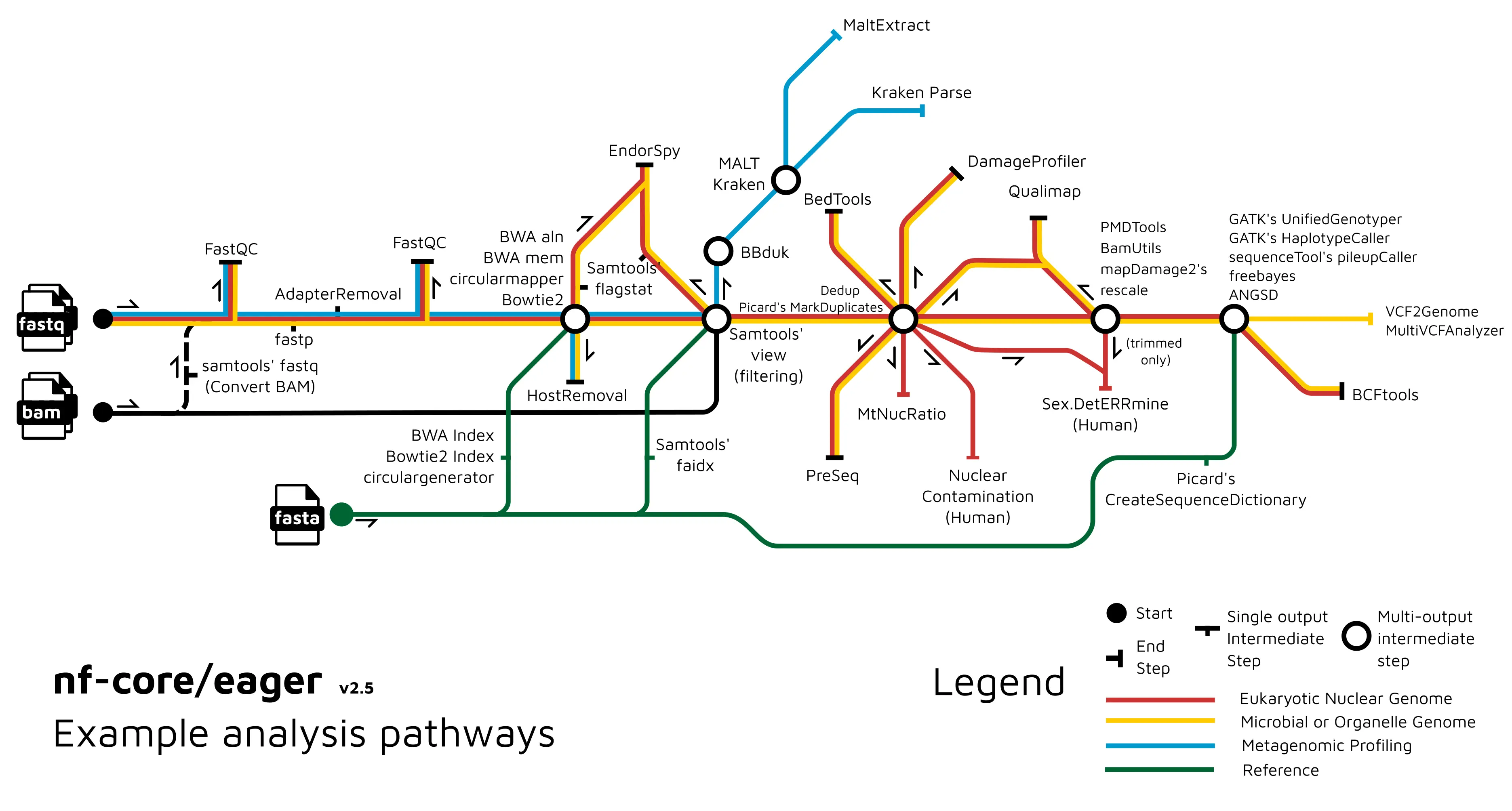
3 You can also make workflow diagrams. This is one from Eager. This is a more a general, broad overview, which helps people to understand what are the major components of the pipeline and what it does. It doesn’t go into too much detail and these are the sections and the tools it uses. If you want something more detailed, you can make something like this, which shows more the direct connections between the different components, the different tools of the particular pipeline. These give you two different purposes: This is more for selling the pipeline, if you want to pique someone’s interest, by for example putting by it in a publication. Whereas this is more for the user who’s actually going to be interacting with the pipeline, trying to run it. There are different stages and levels of such pipeline diagrams. You can use them to help make your pipeline more accessible from the concept of what it does. This format is the one that became quite popular recently, but I’ve been playing around with other variants. This is a new one, that I’m coming up with for nf-core/taxprofiler pipeline. This shows that you don’t have to stick with the particular one that I showed in a previous slide, you can play around with this as well.
4 All of these diagrams, all these images are done in Inkscape. In addition, it doesn’t have to just be diagrams to show what you can do in your documentation. One thing that we did with Eager, which was also quite popular and I was quite proud of, is that my co-author Zandra Fagernäs she drew these very nice schematics cartoony diagrams for the output documentation. This helps people to understand better what they should be looking for when they’re doing quality control in their pipeline runs. For example, she took what you get from MultiQC, so for example FastQC in this case, the first QC section. She drew little cartoony versions of what you should be seeing, separated by the three different boxes, but with little notes saying exactly what you are seeing in this and how you should interpret the results here. This acts as a very nice, quick and fast reference for people, to understand what your pipeline has done at the other end. Also it adds a little bit of fun, a little bit of color, to otherwise often very dry documentation, that can be often be very dull. Particularly for very big pipelines like Eager and Sarek, and when you have a lot of output documentation, such things can break things up a little bit and make it more accessible and more fun for a user to use.
6 There are other things you can do with Inkscape. For example, these are a couple of other things I’ve done. This was a schematic overview of some characteristics of ancient DNA, done all in Inkscape. Actually, all of these little Emojis, have been imported from another project with OpenMoji. Everything is in SVG and it’s very easy to drag and drop it into my image, recolour things, change the size and so on, which is really nice. That’s all benefits of this vector imaging format! Also, you can do more realistic drawings by tracing, which can be done in Inkscape. It’s not so cartoony as all the other previous objects. This is a tooth, cut in half, and that’s showing how to sample for ancient DNA. You can load the raster image into Inkscape then trace over the top and fill in the colours. As such you can get a particularly good representation of the object, which is then very manipulable after.
7 That’s the things you can do with Inkscape. Now, what I’d like to do, is to go into Inkscape itself and show you some of the basic functionalities that you would need, in order to make one of the pipeline diagrams, such as this one and this one.
7 When you open Inkscape it should look something like this. The UIs (user interface) should be relatively familiar: you’ve got the toolbar right at the top, and you’ve got other toolbars on the sides as well. It may look a little bit different, depending on what operating system you are working on, but generally, this is the outline you will have, at least in the latest version. What you should hopefully see on my screen is a key logger, you should be able to see what I’m typing. In the case I use a shortcut, you can also see that, so keep an eye on that as well.
8 The most basic thing you can do in Inkscape, or with a vector image program, is making objects and shapes. I’m going to make here an object, which is a circle. I can make two circles, I can make squares, you can make triangles and convert these to stars and things like hexagons, or whatever. You can also resize these. As you can see, when I click on an object, it often will have either arrows like this, which you can resize like so. Sometimes if you click on this path editor (which I’ll explain in a second) you can also edit with these squares and triangles here.
9 You don’t have to make fixed shapes like that. You can do lines with the Bezier tool here. If I click here and click here, I’ll make a line there; and with this Bezier tool, you’re generating things called paths. These objects are fancy paths, but you can also create your own, random shapes you would like to make. For example, like this. You’re also not fixed to having sharp corners or sharp edges. You can bend edges and you can modify the corners with the options up here, to make them curved as well. Often this path system is how you do a tracing map, as I explained in the previous slide. You can also modify these as well. You can break them apart at the nodes for example… … and then join them together again. There’s many many different ways you can manipulate these. I should clear up slightly…
10 Another thing you can do is to group objects together. You have these two objects and, let’s say, you’re happy with the way they are positioned now, and you want to keep this relationship as you manipulate the image. We can click both: holding shift and clicking the second one. You can press CTRL + g to group them together. You can see now, I’m moving both at the same time, but they’re not losing their position. Furthermore, all objects have an order, they’re overlapping each other. This order you can modify. That’s probably a bad color pairing, sorry, one second, I’ll just try this. What you can see here is, that the two rings overlap each other. By pressing the page up and the page down, I’m moving what is displaying on top. These buttons are here as well, which does the same thing. You can also move to the very top of the stack so you can have as many objects as you want. For example, I can send this pink one right to the bottom as well, like this.
11
Another thing you can do, because everything’s based on a coordinate system, is semi-programmatically reorder everything: aligning and distributing them based on some rule. Let’s say I select all of these objects and I want to put them all in a single line if I go to Object and then Align and Distribute, which should open a panel on the right-hand side here. You have various options on how to arrange and distribute your different objects. Let’s say I want to have them all in a horizontal line, I can press this button here Center on Horizontal Axis and they’ll all go into the line here. The same thing also goes for vertical distribution.
12
Maybe you want to have everything somewhat equally spaced out. You can see these are closer than these ones, and so on. You can do this with these buttons here on Distribute. Then I can blend it, like that, and you can see now, that everything is pretty much ordered in exactly the same way.
12
These objects you can also scale and transform. Scaling. Like I said before, you can drag with the arrows here, but you can also go to the Transform under the Object menu here. You can scale it up programmatically again. I want this one to be twice the size, and press apply, you see twice the size now. If I get the square… You can also rotate things as well, so let’s say 45 degree angle, to get a sort of diamond.
13 You can also do text and all the text generally is also vector based. You can reorder it, detach them, separate them out and so on. Clicking this text tool here, I can start writing something. The latest version of Inkscape (I’ve actually accidentally installed the beta version) is a bit slow with the text for some reason. I’m not entirely sure why, so it might be a bit slower than here, but you get the idea. You can make it bigger like this and and you can also color in the same way as the objects as well.
13
Another nice and important thing for the pipeline diagrams is, you often want to be able to, as well as align and distribute things as you were doing here, bind objects together in a consistent consistent manner. If you press the hash key on your keyboard, you can get a grid. Also in the settings under Document Properties, you can change the size of the grid and the style. With this, it makes it easier for you to position things correctly. When you have a grid on, you can turn on a snapping tool, as you can see up here, that you can also turn on with the percent key. With this, you can have different types of edge snapping. What I mean by that is if I have turned on the midpoint snapping, you can see how this little square pops up. It is basically moving your object, or the middle of the object in this case, to the closest point on the grid here. The same goes for the top corner here. You have to get a feeling for exactly where to hold the object, but you’ll snap it. This way I can make sure… I can see on the grid that I have everything along this line here and use the snapping to alter that accordingly.
15
With coloring, you can see here in these objects, currently I have only colored the outline of the object, this is called a stroke. You can also fill in as well. If I go to Object, then Fill in Stroke. It shows another menu here and you can set the colors, or not. Why is it not working? There we go! They’re transparent, so all objects can be transparent as well.
15 You can see that there are two colors: the outer line is called stroke and inside the object you can have the fill. These can be independently set, which is very nice. This applies to any object. If you want, you can change the colors based on hex colors, or RGB wheels. You can also set different stroke styles. For the moment, let’s change the color again, something more obvious. You can use a solid line and you can also change the thickness of the outline and you can change the style in terms of dashes. Let’s move that example. There is a lot of flexibility in this manner. For example, if you wanted to go with a web-based color, you can use these hex codes, down the bottom. As an example, if I were to go to the nf-core graphics guidelines page, just under the documentation and contributing, you can see for example here under fonts and colors, we have the official RGB values and also the hex value for this particular green. If I switch back here I can change the stroke of this object to this green. Turning off the transparency and now this is the nf-core green.
17
In some cases you may not want an SVG as the final image, but you want to have a different format. That is also possible to do. If you go to File and Export, you have the option to export for example as a PNG image. You can just change it to different resolutions, depending on whether you’re going to be printing or put it on the web and things like that. This means, that you also have that flexibility for different formats.
17 We can move on to the question, how would you actually create the pipeline diagrams? You could create all the different components yourself, separately, but speaking from experience, that can take a lot of time. That’s why we made them for you already, on the nf-core website on the page Graphic design guidelines. It is actually a cheat sheet with all the different components you can use to make a pretty, evenly spaced and distributed pipeline diagram. We also have other components you can download. For example other pipelines, if you want to modify these. You can check the license over here. There are different components. For example for Sarek, Maxime made very nice file icons, which you can also download and use in your own pipeline diagrams. But for this example I’ll use the ones for the pipeline components which I made before.
18
I can simply save this as a file and then drag this particular file into my Inkscape here and press okay. You can see here, now i’ve got all of the objects there. Like I emphasized before, the nice thing about SVG images, because they’re based on coordinate systems, they can be rendered in many different ways. Also downloading and importing this file into my document means I can detach the different components of this and reuse them. For example I could take my starting point and drag this over here. If I follow the grid I will snap it with the midpoint snap here, then I could take the straight line and drag this over here and stick it on there. I could put another station and put that here. Let’s say now I want to do a split. I want to have two different lines because I’ve - let’s say - optional pipelines or mutually exclusive optional steps to the pipeline. I can copy and paste this over here and then by pressing h or v I can flip and rotate the objects in that manner. I will again snap with the midpoint here and the same thing here and connect that there.
20
You get the point. An important thing to emphasize, as you may have already noticed, I’m just copying and pasting. As I said, 80 % of my Inkscape work is copying and pasting components I’ve already made. That is why we made this cheat sheet. I highly recommend you be using this as well, but of course, you can modify them in whatever way you want. To get a basic outline I’d recommend trying something like this and then to modify. If I don’t like this green color I need to ungroup this. I want a different color I can change this to a red. I’m gonna appear I would like this to have a purple on this one to be blue. Just keep working on this and construct things in this very lego-like fashion, that is my main recommendation. In this case, I can then also add a station name. I’ll call it input, put this up here, put this down here. Say - Step one. You want to change the fonts of your text. For example, if you want to use the nf-core font. We have the font called maven pro. You can set this here as well.
21
The final thing is. Maybe once you’ve completed your image, you want to not have this weird A4 sized page. You can also go to File, Document Properties and modify the layout in this way. For example Setting is landscape and also you resize the page to content if I press this button here. You can see that the page has been resized to cover all the different drawings that you may have in the particular document.
21 This is pretty much it! The one other thing I would recommend doing before actually starting such a diagram is already having a working doodle or diagram of your pipeline. Sometimes this can get a bit fiddly when you’re trying to work out exactly how everything should be spaced. For example for nf-core/taxprofiler, we used google drawings and sketched out already all of the different parts of the pipeline. It’s a bit easier to move things around here by snapping them together. Then you can use this as a reference to how to make your final work for documentation. You could take the example at the top. I said is the input. I have the two splits here then I’d set them up like this and follow along the guidelines. I do that here.
22
That is pretty much it. That is the basics of what you need to to learn. To recap: you have all these objects you can make, but when you come to do the pipeline diagrams, it’s better to try and reuse components already made by copying and pasting. You can color things by the menu and objects. To fill in the stroke you have the fill. The stroke is the outline the object and the fill is the inside of the object. You can stretch, manipulate all of the objects, either manually by these handles, or also programmatically with the transform and line and distribute objects. Just have fun doing it! It’s productive procrastination, it does make a difference. A lot of people catch their eye for example on the eager pipeline because of such workflow diagrams. We have a graphics design channel on slack, which you can join if you have any questions. Otherwise I think that is it. Thank you very much! Are there any questions?
24 (host) Thank you very much! Are there any questions in the audience? I have allowed everyone to unmute yourself now, if anyone wants to say something. Otherwise, thank you very much, James, and I want to also thank the Chan Zuckerberg Initiative for funding these talks and as usual, you can continue the discussion on the bytesize Slack channel. Thank you again.